outdoor rooms merging inside & out

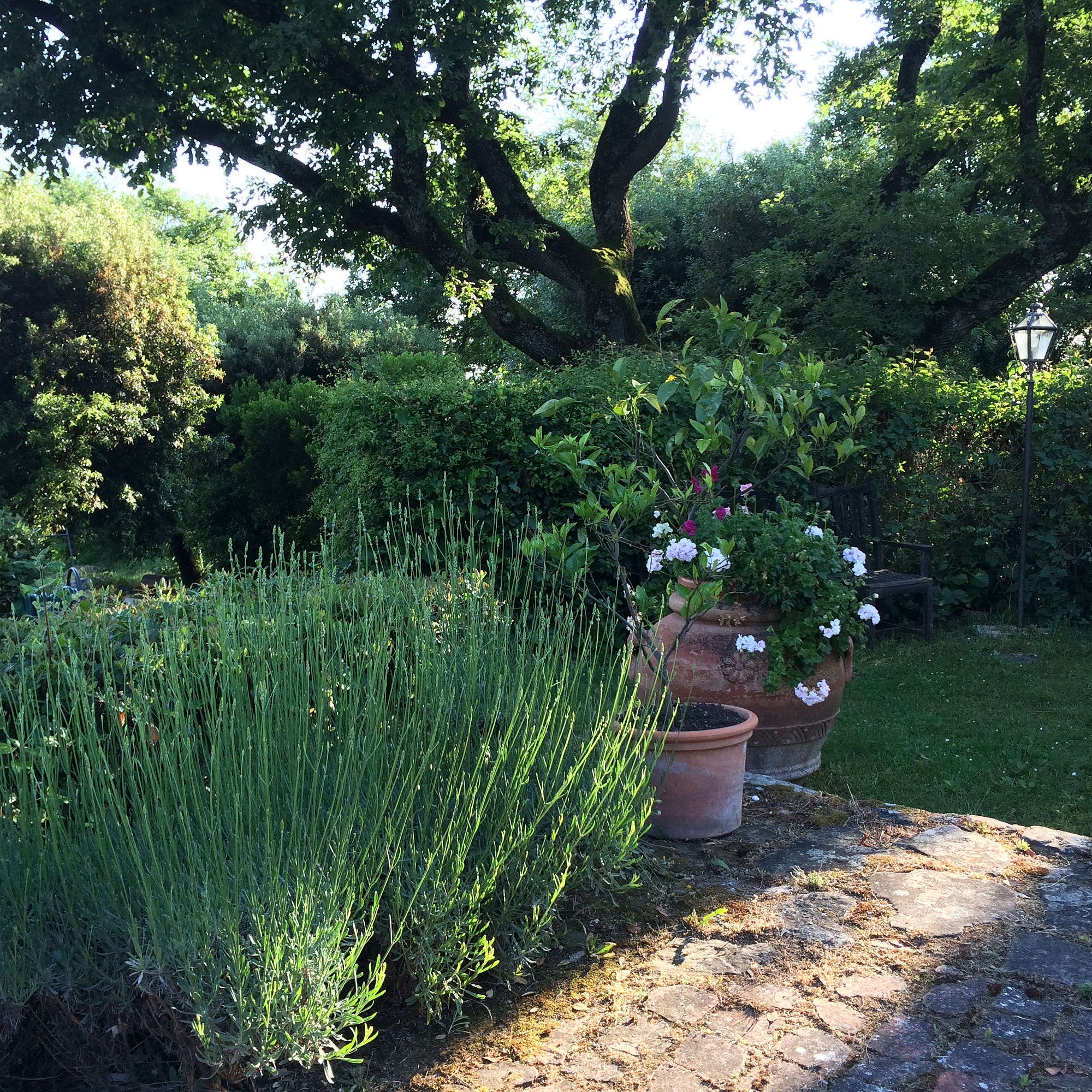
hedge walls and stone and grass floors defining an outdoor room
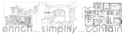
Modern Dwelling

Merging Inside and Out

The natural home — a home intimately connected to and respectful of the earth itself — creates an environment that raises everyday experiences from monotonous to moving, and imprints lasting memories that will impact our lives and the lives of those around us. The ways of merging home and land are abundant. Elements can be incorporated into the modern home to bring it closer to the earth.

Outdoor Rooms

Outdoor rooms offer an easy and economical way to add extra living space to a house without building additional square footage. Porches, decks, walled gardens, hedge enclosed terraces, screened porches and pergolas expand the indoor living space — even if only visually when the weather outside is too hot or cold to physically inhabit them — and directly connect or merge the indoors with the outdoors.

Sunlight

Alternately, daylight presents an expressive medium for drawing the natural world inside, creating mood and character using sunlight. As light enters the house it can be manipulated and shaped; as light passes through openings of different sizes and shapes it creates patterns and forms on adjacent surfaces.

Strong bands of shadow from an overhead trellis, for example, will stripe the floor and wall, accentuating the light source and the surfaces. Light can be refracted into different colors through prismatic cut glass, or light passing from a brightly colored room will take on a hue, glowing colorfully into an adjacent space.

In summer, protective covered porches buffer strong glare or heat from the sun from entering cool interior rooms. A deciduous vine-covered pergola filters summer sunlight, tinting the space with a cool greenish hue. While in the cold winter months, leaves drop off the vines, opening up the house to the bright yellow light and the warm rays of sun.

A light-colored terrace can bounce sunlight into a room from unexpected angles; the light from a reflecting pool outside can dance color across a white plaster ceiling. Translucent skylights or clerestory windows can disperse strong incoming light to a diffuse subtle glow.

Outlook

In the winter months, we can enjoy nature or our garden handiwork from inside. Patterned parterres, stone walls, leafless trees, twiggy trellises, wisps of tall grasses and stalks of seed heads in silhouette against snow or glistening with frost create a painted vista that can be framed by a bank of windows or French door.

The first signs of life viewed from the kitchen window, in a late winter garden activates daydreams of spring and summer. Anticipation for the gardener grows as the plant and seed catalogues roll in, and the snowdrops and crocuses begin to push aside the bleak, wintry soil.

Transition Zones

Transition zones between inside and outside are central to any home — front and side porches, fenced yards, gates and courtyards — but they may also act as a double-edged sword. Transitional spaces are commonly tasked with simultaneously creating a sense of community and of security.

To establish a sense of community, transitional areas demand openness and connection to the world beyond. However, transition zones also ensure a sense of personal security; to achieve this requires some amount of closure and layers of actual or implied fortification. Gates, fences, porches and courtyards provide layers of protection between any possible intruders and us — real or imagined.

At the same time we want our yards and outdoor rooms to convey sanctuary — buffering us from the threats and pressures of the outside world — we want them to be amiable and welcoming to our neighbors and guests.

Balance is best achieved when physical security measures are masked as architectural features designed to enhance the character of the space, and that project a distinguished presence onto the street.

Daily Activity

In the end, it is the activities we enjoy — the summer parties on the deck and lawn, dinners with friends in the screened porch, a hot cup of coffee and Sunday paper enjoyed on a terrace bench, Frisbee with the kids and dog on the newly-mown lawn, or napping in a hammock in a quiet corner of the garden — that let us experience at home that mythical place called Paradise. These are the true everyday benefits of reestablishing a strong connection between our homes and Mother Nature.

Source: https://medium.com/architecture-landscape-...

pantone color trends spring 2015

Everyone needs to know the color trends that the both the Fashion and Home Decor industries refer to as they develop new lines for each season… or, maybe not. It can also just be one of those little design tidbits that you can throw out there to sound like a fashionista!


 http://bit.ly/pantonespring2015


enrich...simplify...contain...3 elements key to good house design

what do we mean by enrich…simplify…contain

while not the only important elements of good house design, these three concepts seemed to best express what Scarlett Architects focuses on in the design of every project. Following is a summary of what we believe is important:

3 elements key to good house design

enrich

Meaning, connection, cultural and symbolic associations expressed in home’s personality

Nature integrated at many levels, indoor/outdoor connections, sustainability, exhibit materials best qualities—oiled woods, unpolished stone, 100% wool carpet

Handicraft as well as technology, hand-drawn sketches and plans add human dimension to the design process—illustrating architectural character—while integrating house technology accommodates modern lifestyle; internet ports; flat-screen plasma television; built-in sound system; central vacuum; gas-fireplaces; air-conditioning…

simplify

Make day-to-day life easier by orchestrating activities and directing traffic flow

Reduce stress by streamlining choice complexity during the design and building process, and in the simplicity of design in the finished home

Smaller building footprint with same or better functionality and appearance

Curb appeal, assistance with architectural choices for the exterior to best express personal and regional design aesthetics and implied social status

contain

A place for everything, all belongings having their own separate, accessible, organized and efficiently labeled (or otherwise signified) spaces… think mud room, front entry, kitchen, family room, playroom, kids rooms.

Custom space planning and generic storage based on in-depth of understanding of space needs gathered through questionnaires, interviews and design reviews.

Lower cost achieved by structuring spaces to allow multi-tasking—dining room as library, family room as Thanksgiving dining area, guest room as home office…

Designing for real needs versus mindlessly accepting generalized or popular design assumptions. Is the double sink better than extra counter space in master bath? Will a Jacuzzi tub get enough use to justify the square footage and expense? Is the kitchen triangle working for your needs?…)

rent-a-quart

TIP   Paint chips can be very deceiving. Always test paint colors in a large swath, at lease 2x3 feet, on opposing walls and under different light conditions to make sure you like it, before all the walls are painted that color.

Rent a quart

Many paint stores have small tester colors that you can buy to paint an area of the wall, which can be very helpful in testing a color, on opposing wall, or in different lights.

Some stores will have a small paint rental program with 50-100 available colors. Debsan in Natick created a one-of-a-kind system where a homeowner can come to his store and rent a quart of any Benjamin Moore Color for just $4.

How it works: Take a quart home and test it on the wall or on our poster board. Return the quart in one week. If they don’t already have a quart of the color you want, they will mix it up and add it to their shelves.

Debsan 25 Main Street Natick MA, 01760 508-653-1360

white and colors

the allure of white walls


More than ever, our homes are critically important to our sense of comfort and well being where we build our own personal nests. The act of decorating our homes is the catalyst that sparks our creativity, providing that special environment that helps us and those who live with us thrive. Color is one of the most important elements in feathering our nests.

Contrary to conventional wisdom, painting the walls pure white is anything but neutral. Pure whites are dazzling and appear brilliant to the human eye. The only place where pure whites can be used effectively is as background where there are strong visual distractions, such as large pieces of art that capture the eye quickly. And these pieces should be either vibrant primary colors or classic black and white. This makes for a super-dramatic setting where pure white becomes a part of the drama. And there are some people who are devout minimalists who want nothing more than the starkness (and visual glare) of black and pure white.

But in actual life settings, most people do not crave that kind of starkness. For decorating purposes it is best to add a touch of another shade or tint to pure white to create an off-white, such as turning a Snow White into a Whisper White. Off-whites are much more effective as neutral backgrounds.

Because it is so highly reflective, especially on fabrics with a sheen, Pristine White acts as a mirror as it reflects the color used immediately next to it. For example, if you use a repeating orange pattern on a white background, the white will warm up slightly, because the orange is so very warm (it is actually perceived as the hottest of all hues). Bright colors generally appear slightly dulled next to pure white.

Mixing whites doesn’t work. Off-whites will look dull and dingy next to pure white. Antique lace curtains will look yellowed and faded next to a pure white shade. Super-sheer white fabrics disclose the color behind them, so they appear less white than a heavier texture. There are also bluish whites and cool greenish whites, but they have to be handled with care as they can get too sterile and glare just as pure white does. Then there are the rosy whites, peachy whites and creamy whites that are friendlier because of their inherent warmth. Any shade of white reflects into adjacent areas, which makes it excellent to use near darkened spaces.

Color usage should always be thought of in context of the area you are using it in and, most importantly, the mood you want to create. Some helpful tips for the usage of certain whites are;

If you want your bedroom to be a quiet and restful sanctuary, try a slightly tinged bluish white, like Bit of Blue or Barely Blue. As their names suggest, there is a mere touch of blue as an undertone as you don’t want the atmosphere to get too cold or sterile.


In the bathroom, the off whites with a hint of rose, such as Shell, or a dollop of peach, as in Ecru, are very flattering to skin tones.


To make an entry way more inviting and welcoming, try a warm of- white like Dawn.


If you love the thought of being surrounded by sunlight, yet do not want to be overwhelmed by yellow, experience the softest rays of sunshine as in Alabaster Sheen.


For a subtle bit of deliciousness in the kitchen that will literally tempt everyone’s taste buds, try a very creamy Crème Brulee.


Painting a ceiling white or off white will always give the illusion of more height to a space.


White trim in a room always adds clean, enhancing and defining touches.


Should you want another option to replace the usual grays, taupes or beiges, try one of mother nature’s favorite neutrals: Whisper Green.


Portions reproduced from “COLORS FOR YOUR EVERY MOOD” with the permission of Leatrice Eiseman.

additional color tips from pantone


using today's color

Using color: if you want to know what the marketing gurus of the world know, check out Pantone. They are  the industry leader in color, defining the color palates of all new home and fashion lines…

2011 A Color for All Seasons
“Courageous. Confident. Vital. A brave new color, for a brave new world. Let the bold spirit of Honeysuckle infuse you, lift you and carry you through the year.

It’s a color for every day – with nothing ‘everyday’ about it.”

“While the 2010 color of the year, Turquoise, served as an escape for many, Honeysuckle emboldens us to face everyday troubles with verve and vigor. A dynamic reddish pink, Honeysuckle is encouraging and uplifting. It elevates our psyche beyond escape, instilling the confidence, courage and spirit to meet the exhaustive challenges that have become part of everyday life.

“In times of stress, we need something to lift our spirits. Honeysuckle is a captivating, stimulating color that gets the adrenaline going – perfect to ward off the blues,” explains Leatrice Eiseman, executive director of the Pantone Color Institute.

“Honeysuckle derives its positive qualities from a powerful bond to its mother color red, the most physical, viscerally alive hue in the spectrum.”

Eiseman continues, “The intensity of this festive reddish pink allures and engages. … may also bring a wave of nostalgia for its associated delicious scent reminiscent of the carefree days of spring and summer.”

Honeysuckle is guaranteed to produce a healthy glow when worn by both men and women. It’s a striking, eye-catching hue … Add a lively flair to interior spaces with Honeysuckle patterned pillows, bedspreads, small appliances and tabletop accessories. Looking for an inexpensive way to perk up your home? Paint a wall in Honeysuckle for a dynamic burst of energy in the family room, kitchen or hallway.”

www.pantone.com

window proportions

four most aesthetic window proportions:


“On this Plate, the upper Window on the left Hand marked A is a true Square, the Height and Breadth being equal.

That of B hath for Height the diagonal Line of A, from Corners to Corner, they being all of one Breadth.

That of C hath for Height the Breadth and three Quarters, as shewn by Divisions on the Side and Bottom.

That of D is twice its Breadth in Height, than which Height none could exceed.”

William Salmon, Palladio Londinensis 1776

kitchen lighting checklist

tips for kitchen lighting

1. Start planning the lighting portion of your kitchen project early in the process.

2. Think about the lighting you have had in the past, how you will be using your new kitchen space, and what you hope to achieve in your new kitchen.

3. A central ceiling light with under cabinet in the task areas may be sufficient for a small kitchen. Larger kitchens present opportunities for using different light sources in combination.

4. Recessed lighting effectively illuminates counter and island areas with higher levels of light. Be sure to place the lights almost directly over the counters to avoid creating shadows. Adjustables may allow fine-tuning to light counters and cabinets. Recessed lights can also be used for general lighting, with special attention paid to placement for good general illumination.

5. For counter areas with cabinets directly above, under cabinet lights can be placed to eliminate shadows and dark areas. Under-cabinet lighting should generally be placed toward the front of the cabinet, with the light source hitting the backsplash.

6. Placing linear light sources above the cabinets is a beautiful design element that also adds function to your new kitchen. This will either brighten the ceiling or create a warm glow.

7. Pendants, mini pendants, or decorative chandeliers can be placed over the island or table for task lighting as well as for more ambient lighting.

8. Explore our Green Zone to discover the great kitchen lighting options available in LED lights and fluorescent lighting. Learn how dimmers and lighting control systems can reduce power consumption and save you money on your energy bill.

make an appointment with one of Wolfers’ expert lighting consultants or just visit our Greater Boston showrooms to view our kitchen lighting labs. Bring in your kitchen plans and your finish surfaces. Explore all of the ways you can light your kitchen and visualize how the light will appear in your home.